Essentiality of Copper Infographic
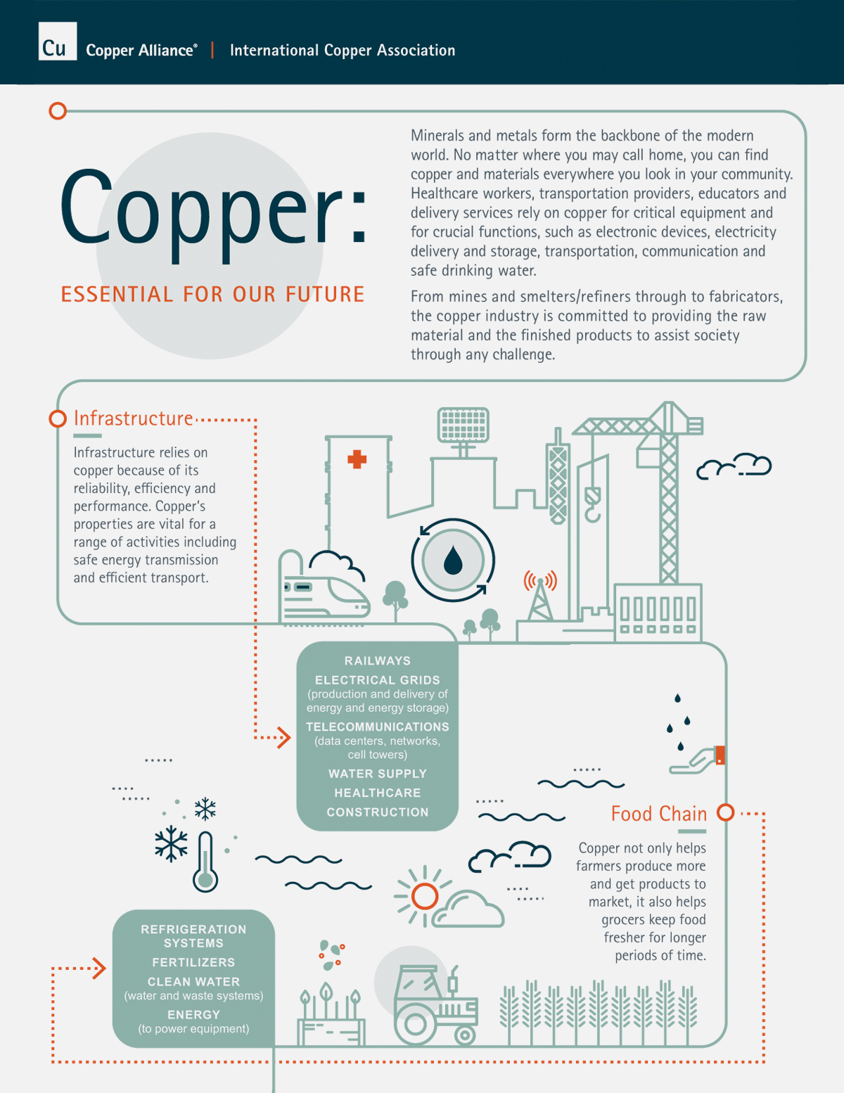
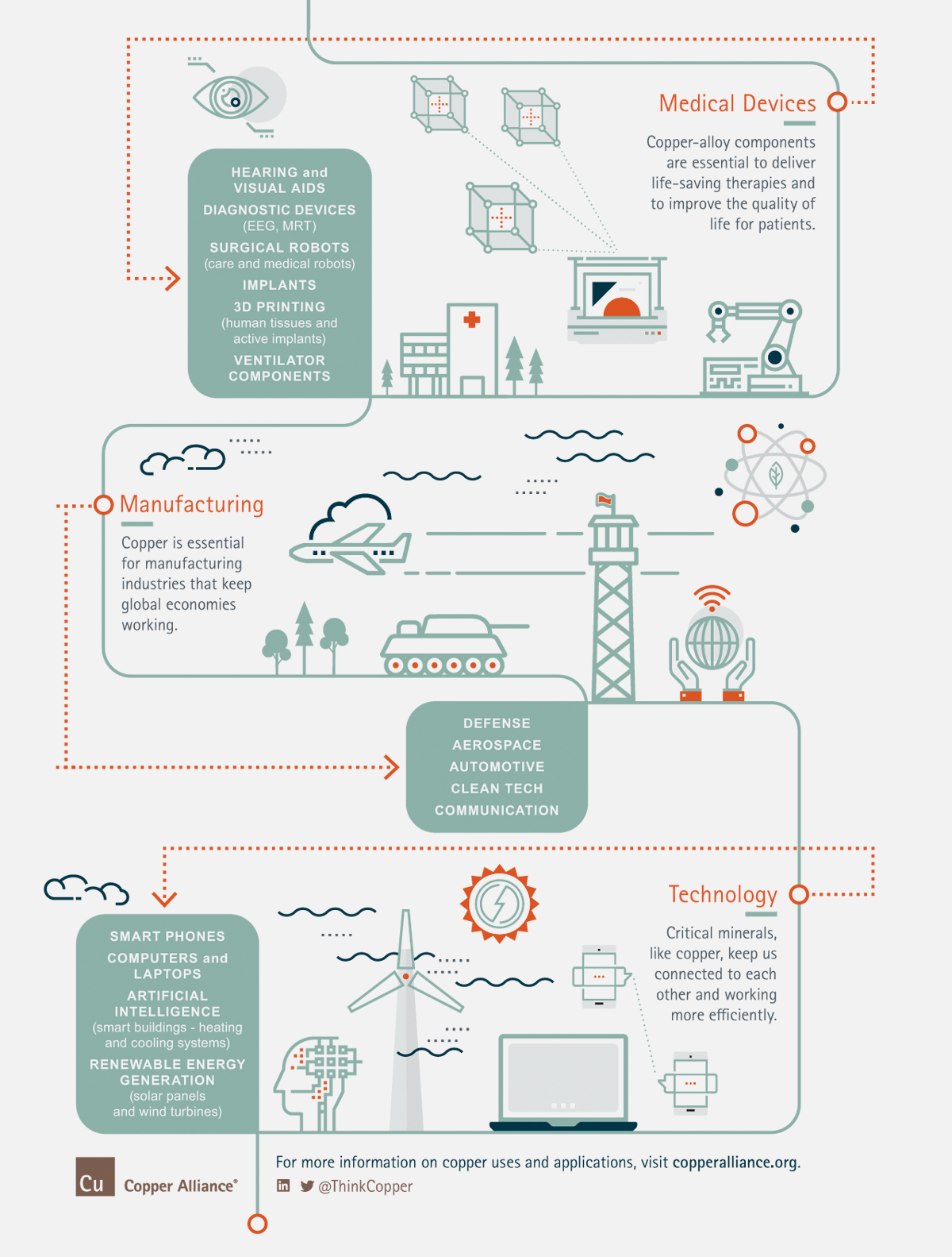
The International Copper Association (ICA) wanted to show the widespread usage of copper in the community. As with the start of many infographics, there was a large quantity of copy that needed to be organized in an easy to read and attention-grabbing way.
A combination of softer brand colors and simple line art illustrations allows us to showcase many different industries without overwhelming the viewer. Continuous lines and bright pops of orange help to focus attention and draw the eye down the graphic.
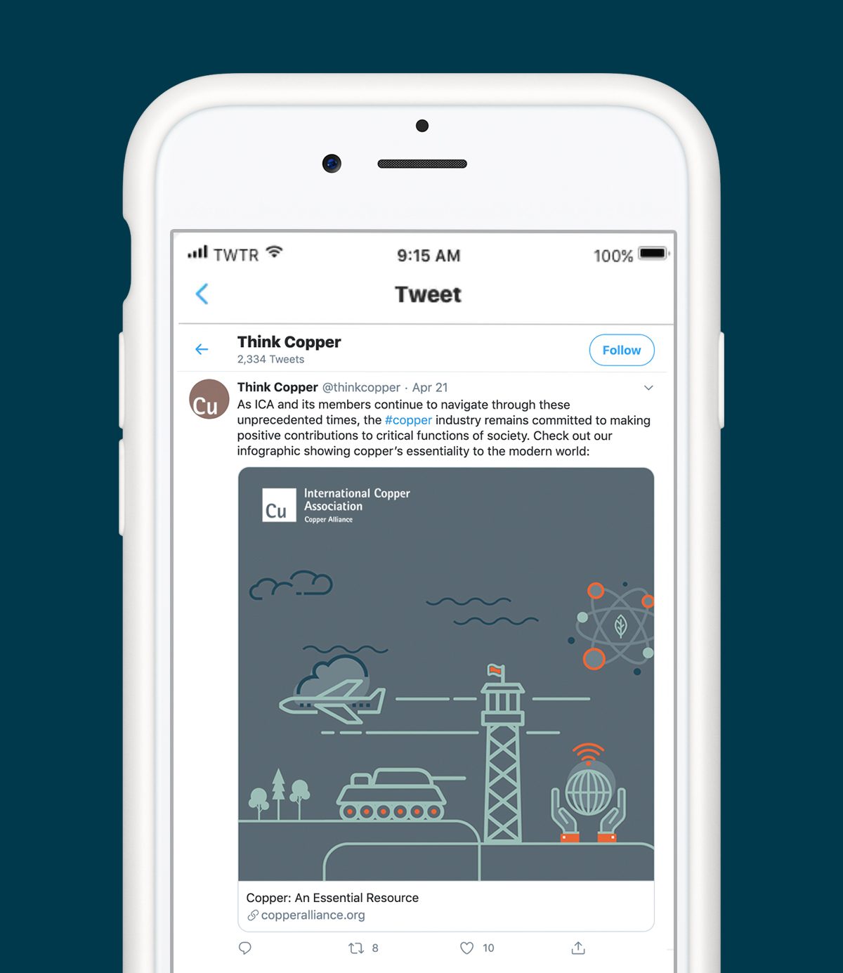
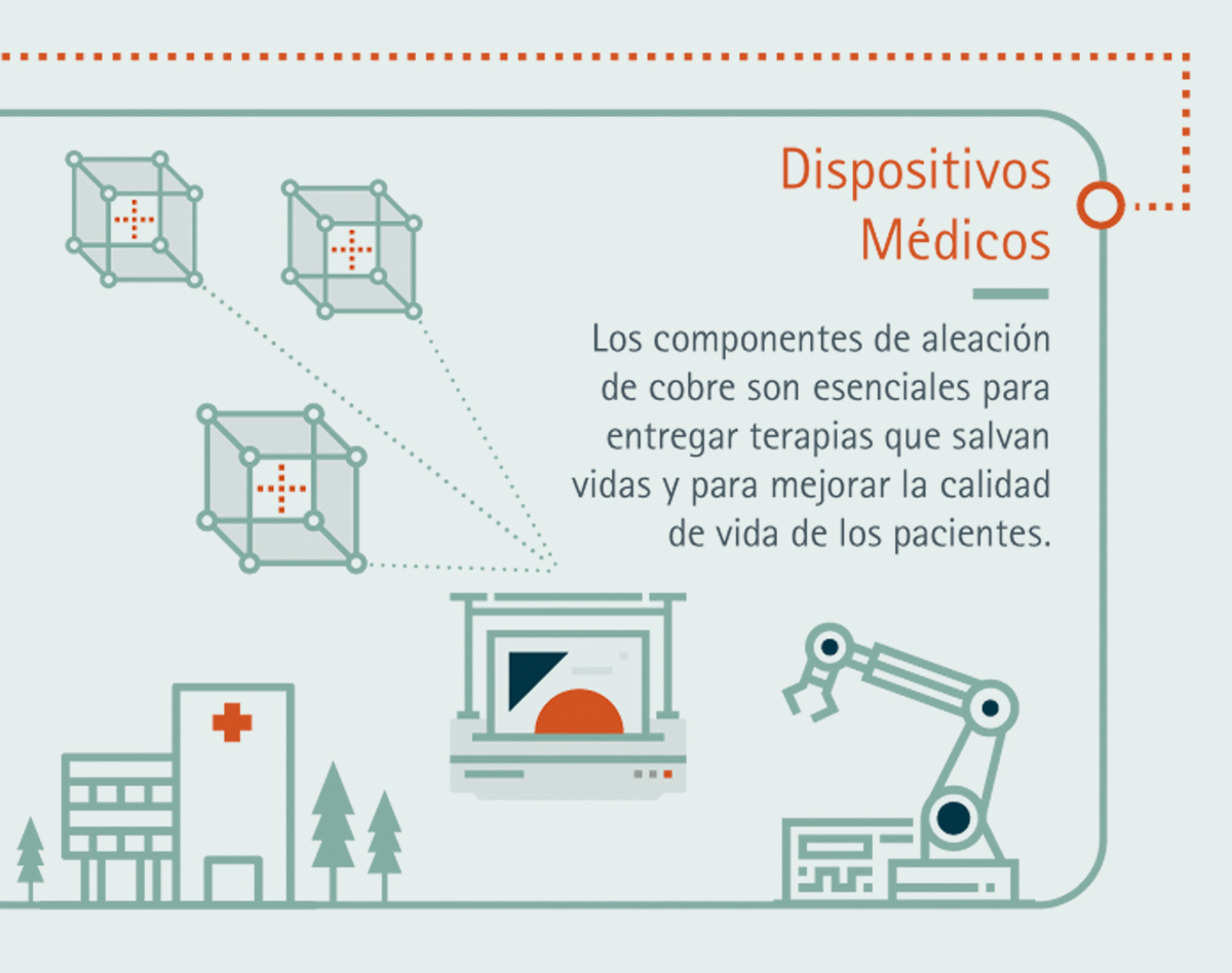
This piece was so well received that it was translated into both Spanish and Chinese, in addition to being divided into individual sections to be shared on social platforms. With several flexible file types provided, this piece can be used for many different communications across the organization.
