

Haven Design Works
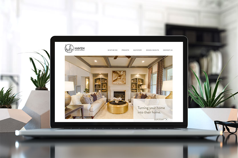
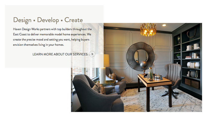
The client had an established look for their initials but needed help pulling in an updated brand font that would work well with them and provide easier readability. Once the new fonts were determined a website overhaul needed to happen. The website required a layout that could highlight the client's large, stunning photos. Accent colors were pulled directly from their portfolio images to provide a smooth visual flow throughout the site. These accent colors were softened with a transparency to ensure the site visitor's focus remains on the photos.
This work was done in collaboration with the development team at GreenMellen.


